This is a guest post by Justin Rondeau of Should I Test That?
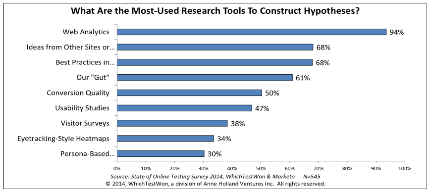
Testing without analytics is like a sandwich without bread, it’s messy and ultimately unsatisfying. According to a survey by WhichTestWon & Marketo, 94% of marketers reported that they refer to their analytics reports when identifying test hypotheses – I honestly have no idea what the other 6% are doing…
Analytics are the backbone to any great test, unfortunately there is so much information it is easy to get lost. Today you’ll learn three important places to look in your analytics report for test inspiration.
Where To Look
Whenever I take on a new client, I immediately ask for access to their analytics platform. Any ‘expert’ that gives advice without knowing the underlying data points, is merely guessing at what might work for you. Guesses are meaningless in our data driven world.
I noticed some interesting trends after analyzing more than 2,500 tests and working with dozens of clients ranging from small businesses to Fortune 500 companies. If you’re new to testing, these three reports will give your test the most bang for its buck.
1. Site Search
Site search is arguably one of the most important reports for any ecommerce site. This single report gives insight into what your customers want, and what pages aren’t meeting their needs.
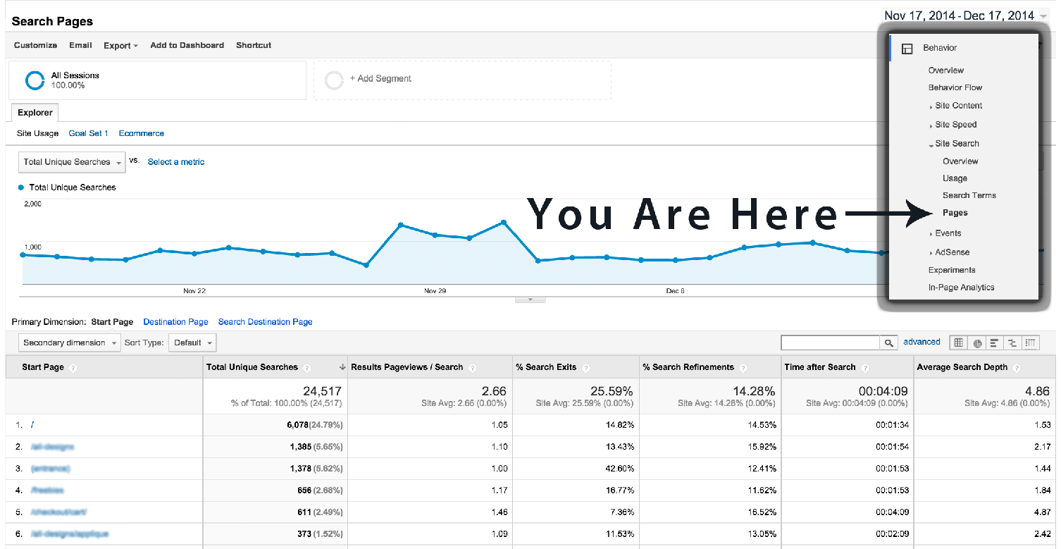
To find this report click Behavior, then Site Search, and finally Pages.
What You’re Looking At
This report tells you the pages where visitors begin site search. So what exactly does this mean? It means a visitor can’t find what they are looking for on your page!
In this example the page with the most search starts is the homepage, which will likely be the case for the bulk of readers. Click the ‘/’ to get a full list of the search terms on this page.
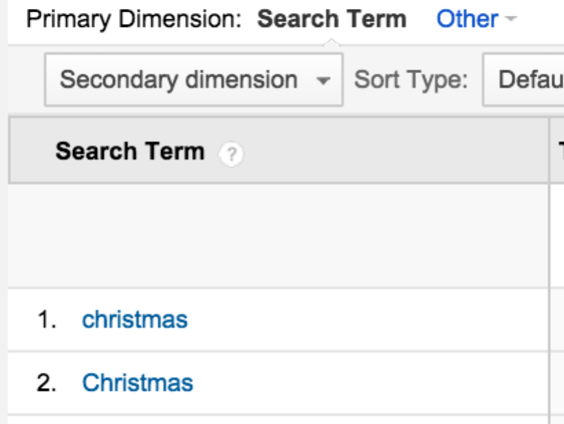
For this company, the term ‘Christmas’ was the most searched term on the homepage. If customers are looking for Christmas products, it makes more sense to provide your Christmas offering on the homepage.
You identified what your visitors want and where they wanted it, now go give it to them! Simple right?
Another interesting search report is the ‘Usage’ report. In general, visitors that use site search, convert 5-6 times that of users who don’t use site search. In other words, the conversion rate should be much higher for visitors that use site search.

The funny thing about site search is that a visitor that uses site search is more likely to convert if they can find what they are looking for on page one. If not, consider that visitor a goner.
Tip: If your conversion rate is the same, or worse, you know that your search results page need to be tested immediately!
Here are three tests inspired by the site search report:
-
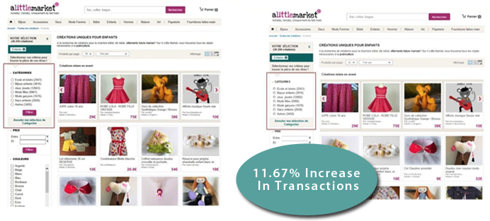
Search Results Page Tests – Look at your page and find out why people aren’t converting. In this case study, the team did one thing better than analyzing their search results page - they turned their category page into a search results page. Reducing the perceived page path is a great way to increase conversions. Making search easier & automatic was a major win for this ecommerce site.
![What You’re Looking At What You’re Looking At]()
-
Product/Content Tests – Try placing relevant content based on search terms on your most searched pages against your standard content.
![What You’re Looking At What You’re Looking At]() This test launched an exit overlay when a visitor hadn’t used any of the search filters but used internal search using specific keywords. The results were amazing! This exit overlay increased revenue by 42.68%!
This test launched an exit overlay when a visitor hadn’t used any of the search filters but used internal search using specific keywords. The results were amazing! This exit overlay increased revenue by 42.68%! -
A Personalization Test – Use personalization tech to show search term related products on searched pages for return visitors.
![What You’re Looking At What You’re Looking At]() On my initial visit to Wayfair.com, I searched for dressers. Upon my return visit to the ‘Top Picks For You’ section was filled with dressers. This is a simple personalization tactic and can boost conversions. For personalization tests, you need to make sure you get enough traffic and you scale your learnings appropriately. In other words, if you run a test on return visitors, don’t assume it will work for new visitors!
On my initial visit to Wayfair.com, I searched for dressers. Upon my return visit to the ‘Top Picks For You’ section was filled with dressers. This is a simple personalization tactic and can boost conversions. For personalization tests, you need to make sure you get enough traffic and you scale your learnings appropriately. In other words, if you run a test on return visitors, don’t assume it will work for new visitors!
2. Exit Pages
Exits, as opposed to bounces, aren’t inherently a bad metric. In fact they are perfectly reasonable on your end-of-content pages. Exit pages become an issue when they occur on pages that aren’t intended to be the final piece of content. These are pages that are ripe for testing.
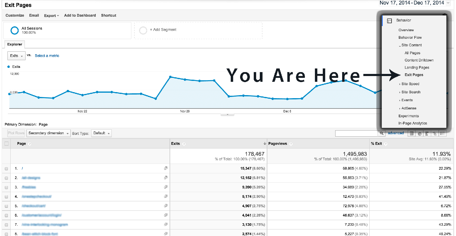
To find this report click Behavior, then Site Content, and finally Exit Pages.
What You’re Looking At
This page outlines the top exit pages on your site. Your homepage will likely be the top page on this report too. Just because your homepage is the top exit page it isn’t my intention to tell you to immediately test your homepage. Frankly your homepage will ALWAYS be at the top of this list.
Homepage aside, you should be looking for a page that isn’t the last bit of content but has a high exit rate. The perfect example would be your cart or contact page. These pages will likely be in your top 10, and there is real opportunity to move the needle testing these pages.
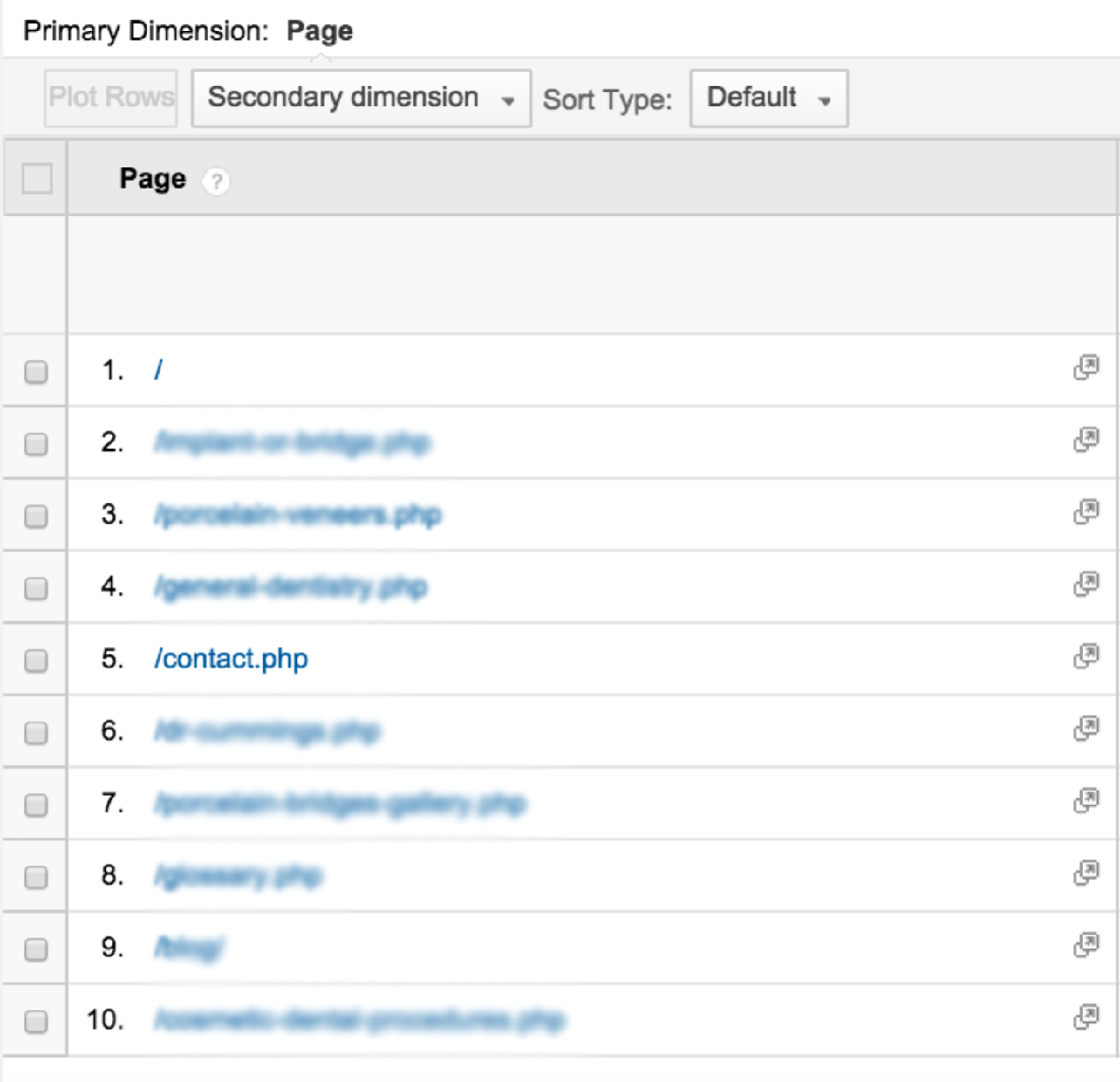
In this example the contact page is in the top 10 most exited pages. When I pointed this out to my client, they were not pleased – mainly because this was one of their most important pages for generating leads.
The analytics pointed out that there was a major problem on this page, but that’s as far as analytics go. You have to put these numbers in context, and analyze the page to find out why people are leaving. That’s why we test!
This is a straightforward report that helps indicate the holes on your pages. I’d also recommend looking at the previous page path to make sure there isn’t a major disconnect between the previous page content and the exit page.
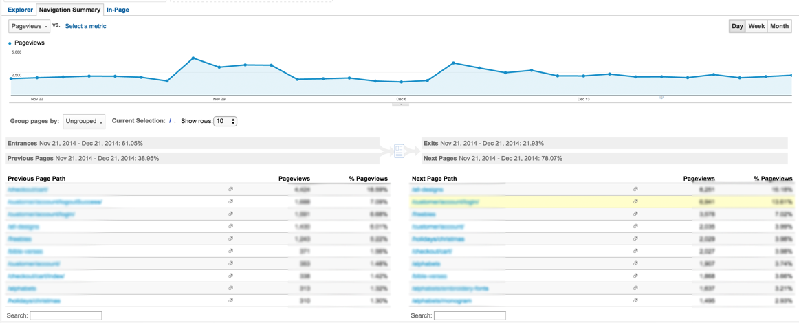
If there is a content mismatch, e.g., an offer on a previous page that isn’t repeated on the exit page, then you’ve found your problem!
Here are three test ideas inspired by the exit report:
-
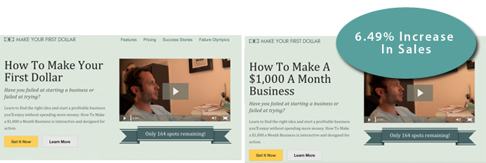
A headline or call to action tests - People are likely exiting because they are unclear about your offer or what to do next. The headline and call to action are some of the most important content on your page, so these tests could help increase clarity and decrease exits!
![What You’re Looking At What You’re Looking At]() Here is a great example of making sure your message matches your visitors’ expectations. By just changing the headline to ‘How To Make A $1,000 A Month Business’ the page was able to speak toward an end-goal rather than the first step.
Here is a great example of making sure your message matches your visitors’ expectations. By just changing the headline to ‘How To Make A $1,000 A Month Business’ the page was able to speak toward an end-goal rather than the first step. -
A content layout test - Try testing your content layout to make sure your most important information is placed appropriately. For example if you are on a contact page, but the contact form is buried below the fold – then you’ve found your problem!
![What You’re Looking At What You’re Looking At]()
This is a classic case of an overlooked form. The horizontal layout creates an awkward eyeflow and is easy to glaze over. The vertical layout ‘breaks the grid’ and immediately gives the visitor clear instructions. -
An exit overlay test - Let’s face it, your page will never get to 0 exits. People will leave your site, so try to get the most out of them. For a visitor who is about to abandon a cart, a simple ‘Are You Sure’ may suffice. For visitors leaving a general content page, you may want to trigger a newsletter form to turn them into a marketable lead.
![What You’re Looking At What You’re Looking At]() When YourMechanic added an exit overlay to their PPC landing page, they converted 7.16% more visitors who would have otherwise abandoned the page. There are several more exit overlay posts where this came from here.
When YourMechanic added an exit overlay to their PPC landing page, they converted 7.16% more visitors who would have otherwise abandoned the page. There are several more exit overlay posts where this came from here.
New Vs. Returning Visitors
This is one of the most basic ways to segment your users, but is still very powerful. For those of you new to segmentation, keep it simple – and that’s just what this report is: simple.
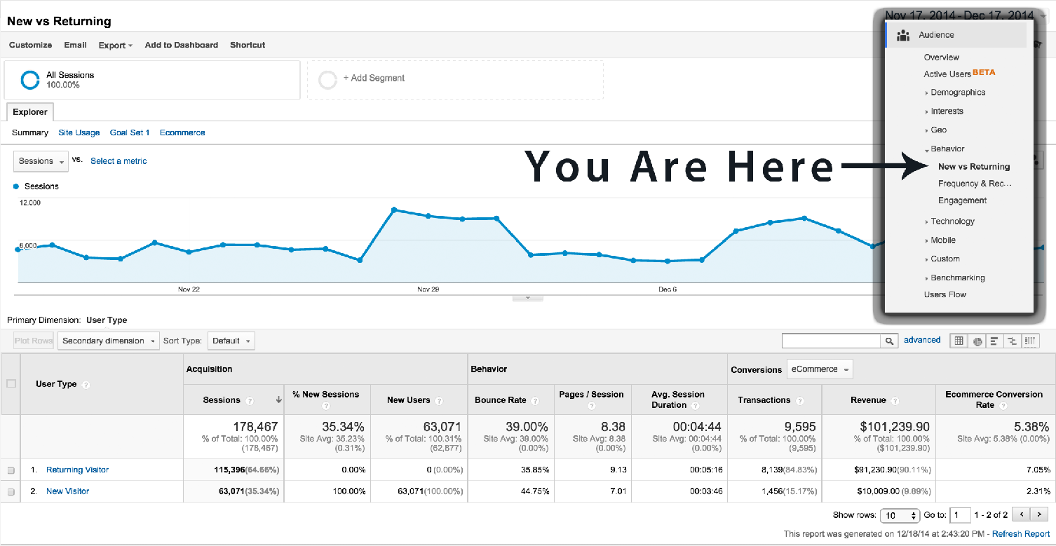
New visitors behave much differently than return visitors. In most cases the new visitor is just getting familiar with your brand, and seeing if you credible fit for their needs.
If you have a large number of new visitors, I recommend trying to get them on your marketing list as soon as possible. When of the best ways to do this is with a micro interaction such as an overlay.
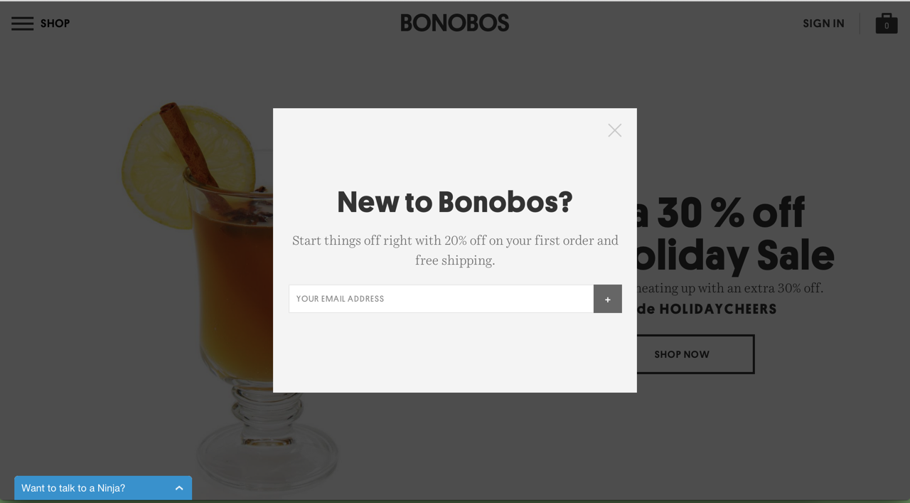
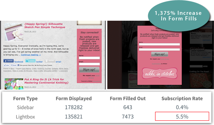
Here’s a great example of trying to get a new visitor on the marketing list.
You can trigger these overlays based on time on site, page depth, scroll depth, or exit click/intent. This disruptive approach can be extremely effective and when done right is considered an asset not an annoyance. If you want more details check out this article about properly overlay protocol.
When there are a large number of return visitors, it might be time to tailor an experience more consistent with their needs. This is when it’s important to use personalization to remind them of previous purchases, product views, or interactions.
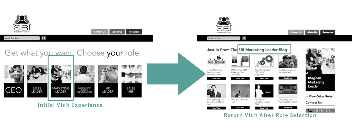
HubSpot shared an interesting example by Sales Benchmark Index. Upon your initial entrance to the site, you are asked to self segment yourself by choosing your role. The next time you return to the site, the default entrance page will load the role you initially selected. This is a great way to give return traffic exactly what they want.
If you don’t have the sophistication to personalize the experience for return visitors, at the very least make sure your new visitor micro interactions aren’t being displayed! Good news, if you’re a Shopify user you do have this technology at your disposal - so get to it!
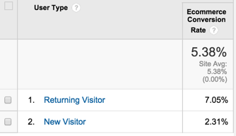
In the screenshot above, did you notice the ecommerce conversion rate? New visitors only accounted for 2.31% of ecommerce conversions and returning visitors accounted for 7.05%! The ultimate goal for this site is to turn as many new visitors into return visitors since they buy products at a higher rate.
This is a perfect case for increased touch points with customers to make them return to your site. A study found that new customers spend on average $24.50 and return customers spend $52.50. The concept that a return customer is easier to convert than a new customer is nothing new and this report sends that message home.
If you take one thing away from this report it is this:
New visitors act very differently than return visitors – don’t give them the same experience!
Here are three test ideas inspired by new vs. returning report:
-
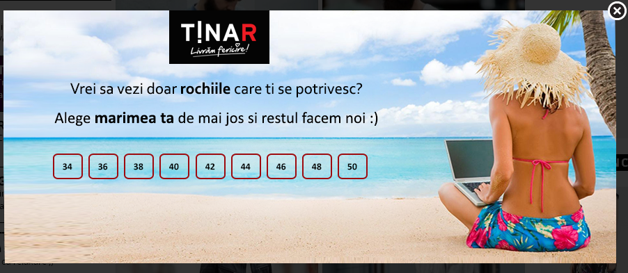
A Timed Entrance Overlay Test –The timing is crucial, so this may require a few iterations. I recommend testing 5 seconds and 15 seconds. If you have the traffic, I also recommend a test between a timed entrance overlay and an exit overlay. AWeber shared a great case study on a blog that used an entrance overlay. The overlay showed once every 60 days and was triggered after a visitor was on the site for 2 seconds. The overlay is very useful, if you don’t annoy your visitors. Tread lightly, and try not to be a nuisance.
![New Vs. Returning Visitors New Vs. Returning Visitors]()
-
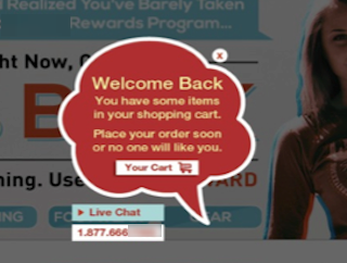
Return Visitor Personalization - Try a welcome back message for return visitors based on their entry point. If they click a link in an email campaign, make sure the welcome back message is consistent with the tone and delivers the promises made in the email.
![New Vs. Returning Visitors New Vs. Returning Visitors]()
In this example, this retailer tested a return message for abandoned cart visitors coming from any entrance point. The overlay showed whenever a visitor who previously abandoned the cart visited the website. This lead to a 17% increase in checkouts from cart abandoners. Nosto is a great Shopify app that works well for many of the personalization options mentioned so far.
Key: know your audience and their intentions to increase conversions. -
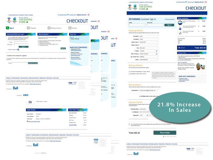
Guest Checkout Test - If you don’t offer guest checkout, try it out. This won’t alienate new visitors who either 1) don’t want an account or 2) have different purchase intents, e.g., buying a gift for a friend and don’t plan on returning.
![New Vs. Returning Visitors New Vs. Returning Visitors]() This test, published by ElasticPath, showed the power of a single-step checkout. What’s most interesting about this test, is the winning variation didn’t require a visitor to create an account. There are other changes to this page, but it is clear a simple cart is better than a complex one!
This test, published by ElasticPath, showed the power of a single-step checkout. What’s most interesting about this test, is the winning variation didn’t require a visitor to create an account. There are other changes to this page, but it is clear a simple cart is better than a complex one!
Oh, and if you want to have people create accounts, ask them to do it AFTER the purchase is complete on the ‘Thank You’ page.
Test 1’s main goal is to turn new visitors into returning visitors and test 2 is focused on tailoring a custom experience to return visitors to help them convert. Test 3 is a little different; it recognizes that not all new visitors will come back. By testing guest checkout, your main goal is to increase the new visitor purchase rate.
So there are nine tests you can come up with after digging through these reports. Cool right?
Remember, this is only the tip of the iceberg; there are many other factors to consider when testing, e.g., customer surveys, click tracking, and other qualitative data points.
If you start developing tests with your analytics in mind, your tests will be much more effective.
Happy Testing!
About The Author: Justin Rondeau is a renegade philosopher turned digital analytics & testing speaker. He is the principal at Should I Test That? and likes like good beer, new connections and dance parties.
Conversion Rates FAQ
What is conversion rate rate?
What is good conversion rate?
Why is conversion rate important?
What is the difference between CTR and conversion rate?
Topics:
Join 446,005 entrepreneurs who already have a head start.
Get free online marketing tips and resources delivered directly to your inbox.
Thanks for subscribing
You’ll start receiving free tips and resources soon. In the meantime, start building your store with a free 14-day trial of Shopify.
 On my initial visit to Wayfair.com, I searched for dressers. Upon my return visit to the ‘Top Picks For You’ section was filled with dressers. This is a simple personalization tactic and can boost conversions. For personalization tests, you need to make sure you get enough traffic and you scale your learnings appropriately. In other words, if you run a test on return visitors, don’t assume it will work for new visitors!

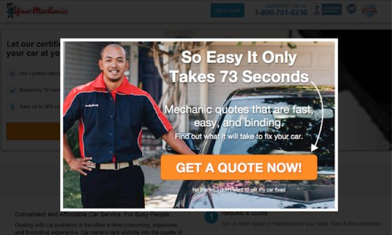 When YourMechanic added an exit overlay to their PPC landing page, they converted 7.16% more visitors who would have otherwise abandoned the page.